Our Blog Development
What is Responsive Design?

Written by: Steven Brown
March 1, 2025
What is Responsive Design?
Introduction
In today's digital world, users access websites from a variety of devices, including desktops, tablets, and smartphones. Ensuring a seamless user experience across different screen sizes and resolutions is crucial. This is where responsive design comes in.
Definition of Responsive Design
Responsive design is an approach to web design that makes web pages render well on different devices and window sizes. It ensures that a website adapts dynamically to various screen sizes without compromising usability or aesthetics.
Key Elements of Responsive Design
1. Flexible Grid Layouts
A responsive website uses a fluid grid system where elements are sized in relative units (like percentages) rather than fixed units (like pixels). This allows the content to adjust proportionally to different screen sizes.
Strategies for Implementing Flexible Grids:
- Use CSS Grid and Flexbox for dynamic layouts.
- Set width using percentages instead of fixed pixel values.
- Utilize
min-widthandmax-widthproperties to prevent excessive shrinking or stretching. - Ensure proper spacing and padding to maintain readability across devices.
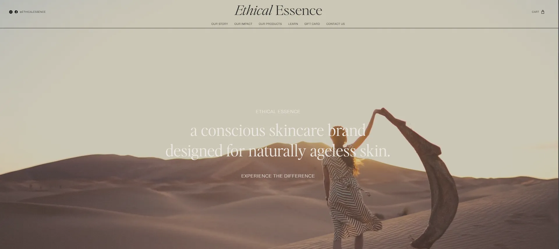
Example: Ethical Essence (https://www.ethicalessence.com/)
The eCommerce website Ethical Essence effectively implements flexible grid layouts by displaying multiple product images on desktop while switching to a single-column format on mobile screens. This allows each product image to stand out while keeping the browsing experience intuitive.

2. Media Queries
Media queries are CSS techniques that apply different styles based on the characteristics of the user's device, such as screen width, height, and resolution. They enable developers to create breakpoints for different screen sizes, ensuring optimal display.
Strategies for Using Media Queries Effectively:
- Define breakpoints based on common screen sizes (e.g., 768px for tablets, 1024px for desktops).
- Use
emorremunits instead of pixels to improve scalability. - Apply
orientationrules to adjust layouts for landscape or portrait modes. - Use mobile-first CSS by writing styles for smaller screens first and progressively adding styles for larger screens.
Example: The Boathouse Agency (https://www.theboathouse.agency/)
The Boathouse Agency utilizes media queries to ensure that its visually dynamic homepage adapts smoothly to different screen sizes. On desktop, their navigation includes videos and animations, while on mobile, they simplify the interface, replacing videos with static images for better performance.

3. Flexible Images and Media
Images and other media elements should be flexible and scalable to prevent distortion or overflow. Using CSS properties like max-width: 100% ensures that images resize according to the screen width.
Strategies for Handling Flexible Media:
- Use
srcsetandpictureelements to serve different image sizes based on screen resolution. - Optimize images using modern formats like WebP to reduce load times.
- Apply
object-fit: cover;to maintain aspect ratio without distortion. - Ensure that embedded videos are responsive using CSS aspect ratio containers.
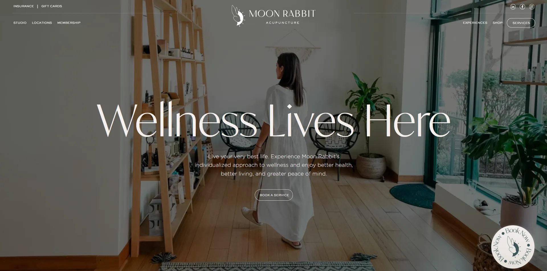
Example: Moon Rabbit Acupuncture (https://www.moonrabbitacupuncture.com/)
The website for Moon Rabbit Acupuncture showcases high-resolution images that scale perfectly across devices. The flexible grid ensures that images remain clear and well-positioned whether viewed on a desktop or mobile screen.

4. Mobile-First Approach
A mobile-first approach means designing the website for smaller screens first and then progressively enhancing it for larger screens. This ensures that mobile users receive an optimized experience without unnecessary content or design elements.
Strategies for Mobile-First Design:
- Start by designing for the smallest screen size and expand as needed.
- Prioritize essential content and remove non-critical elements for mobile views.
- Use progressive enhancement, adding more complex layouts for larger screens.
- Optimize font sizes and buttons for touch-friendly interactions.
Example: Visual Identity Co. (https://www.visualidentity.co.in/)
Visual Identity Co. ensures a seamless experience across all devices by maintaining animations and interactions in both mobile and desktop versions. The mobile-first design ensures that their site performs well even on lower-powered devices without compromising visuals.

5. Responsive Navigation
Navigation menus should adapt to different screen sizes. Common responsive navigation techniques include collapsible menus, off-canvas menus, and hamburger icons for mobile screens.
Strategies for Responsive Navigation:
- Implement a hamburger menu for small screens, expanding upon user interaction.
- Use a sticky navigation bar for easier accessibility on mobile devices.
- Prioritize essential menu items while hiding or collapsing secondary options.
- Ensure tap targets are large enough for touchscreen devices.
- Use CSS animations for smooth transitions between open and closed states.
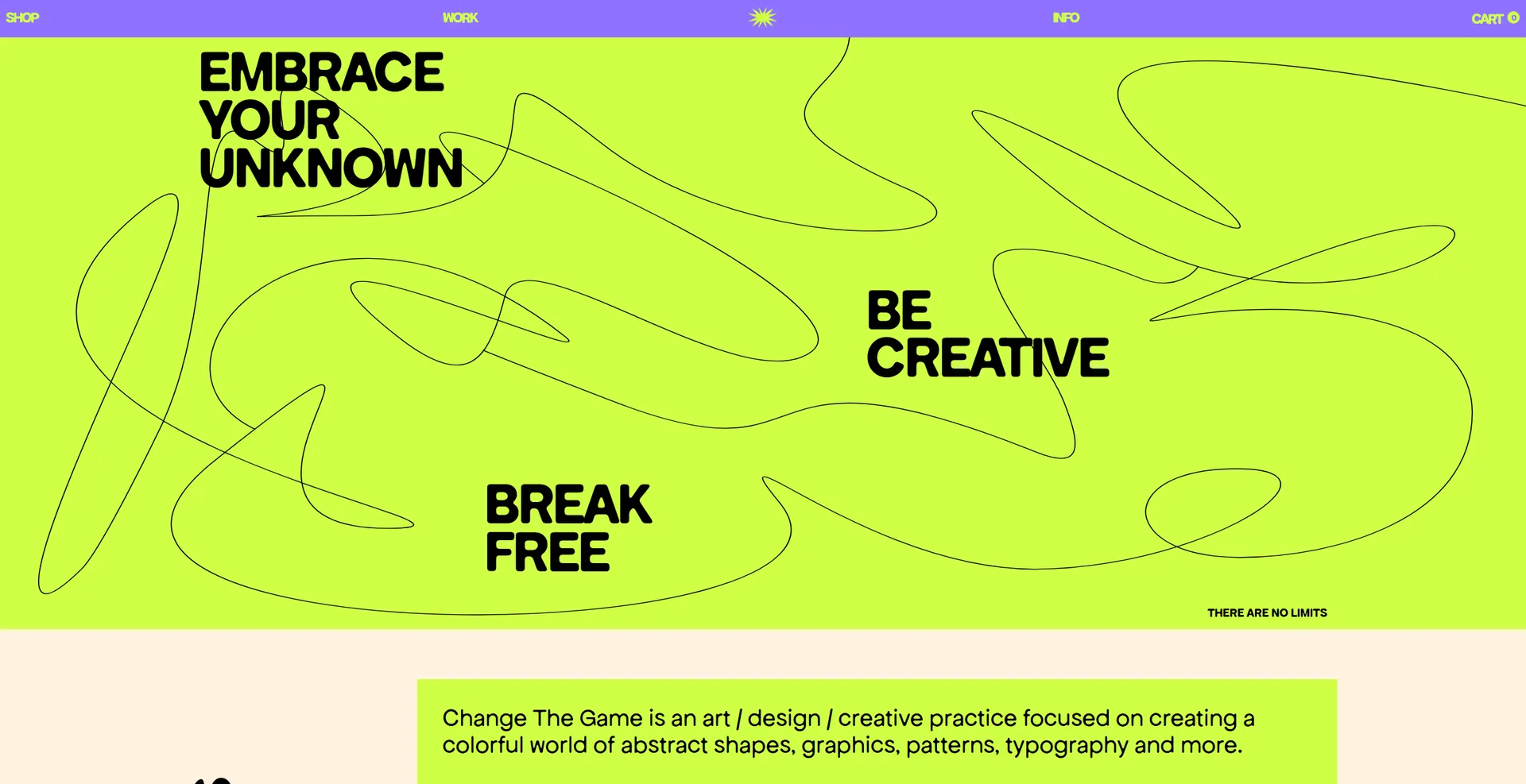
Example: Change the Game Studio (https://www.changethegame.studio/)
The website for Change the Game Studio embraces responsive navigation with a visually striking yet functional design. Instead of using a hamburger menu, the mobile version of the site keeps the navigation options easily accessible, ensuring a user-friendly browsing experience.

Benefits of Responsive Design
- Improved User Experience: A responsive website ensures that users have a seamless experience across all devices.
- Better SEO Ranking: Google prioritizes mobile-friendly websites in search results, improving visibility and traffic.
- Cost-Effective: Instead of maintaining separate desktop and mobile versions, a single responsive site saves development and maintenance costs.
- Increased Reach: Responsive design allows businesses to reach a wider audience by catering to users on all devices.
Conclusion
Responsive design is essential for creating modern, user-friendly websites. By implementing flexible grids, media queries, scalable images, and mobile-first principles, businesses can enhance user experience, improve search engine rankings, and ensure their website remains accessible to all users.
If you're looking to create a responsive website for your business, Bliztek can help you develop a tailored solution that meets your needs. Contact us today to get started!

Steven Brown
Software Engineer
I am a Software Engineer based in the United States, passionate about writing code and developing applications. My journey into tech followed a unique path, beginning with a 9-year enlistment as a Russian Cryptologic Linguist in the US Army. This experience has fueled my unwavering commitment to excel in all aspects of software engineering.


